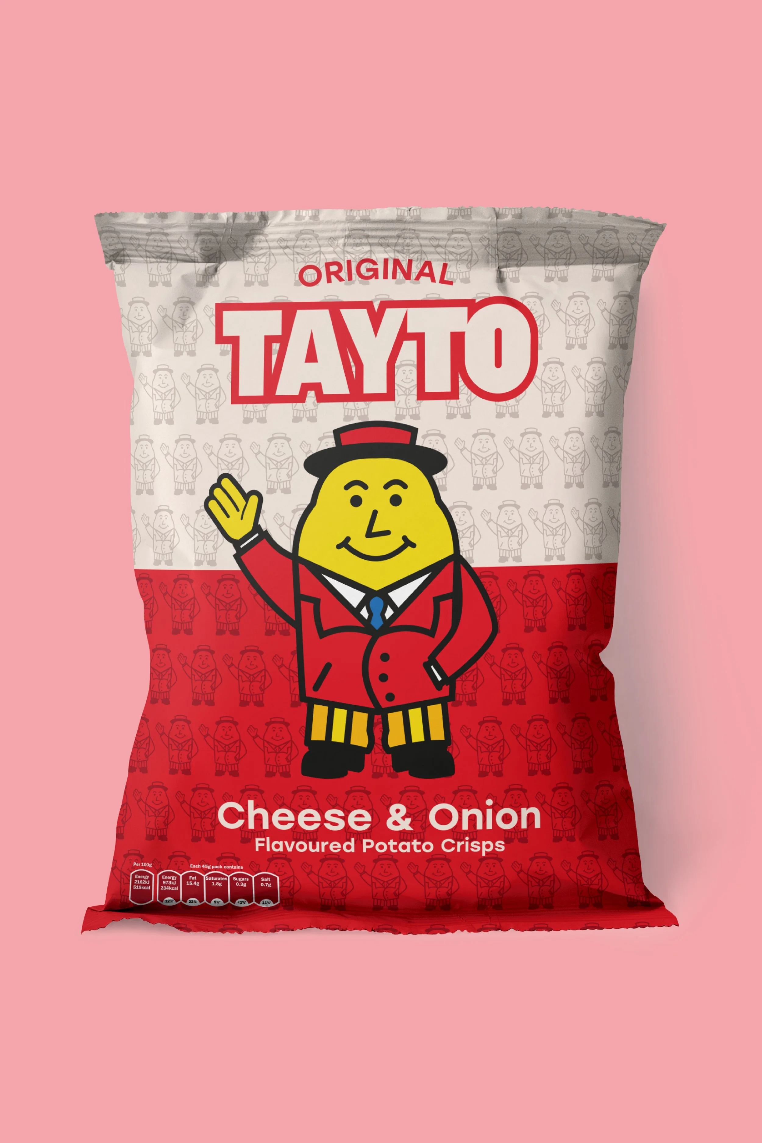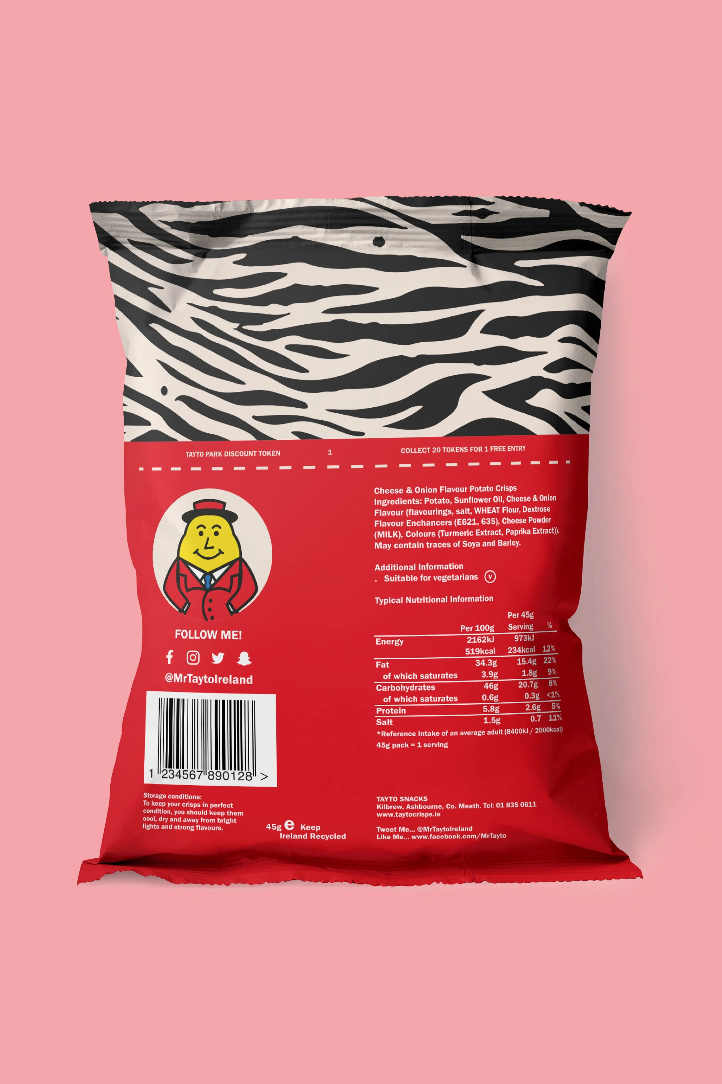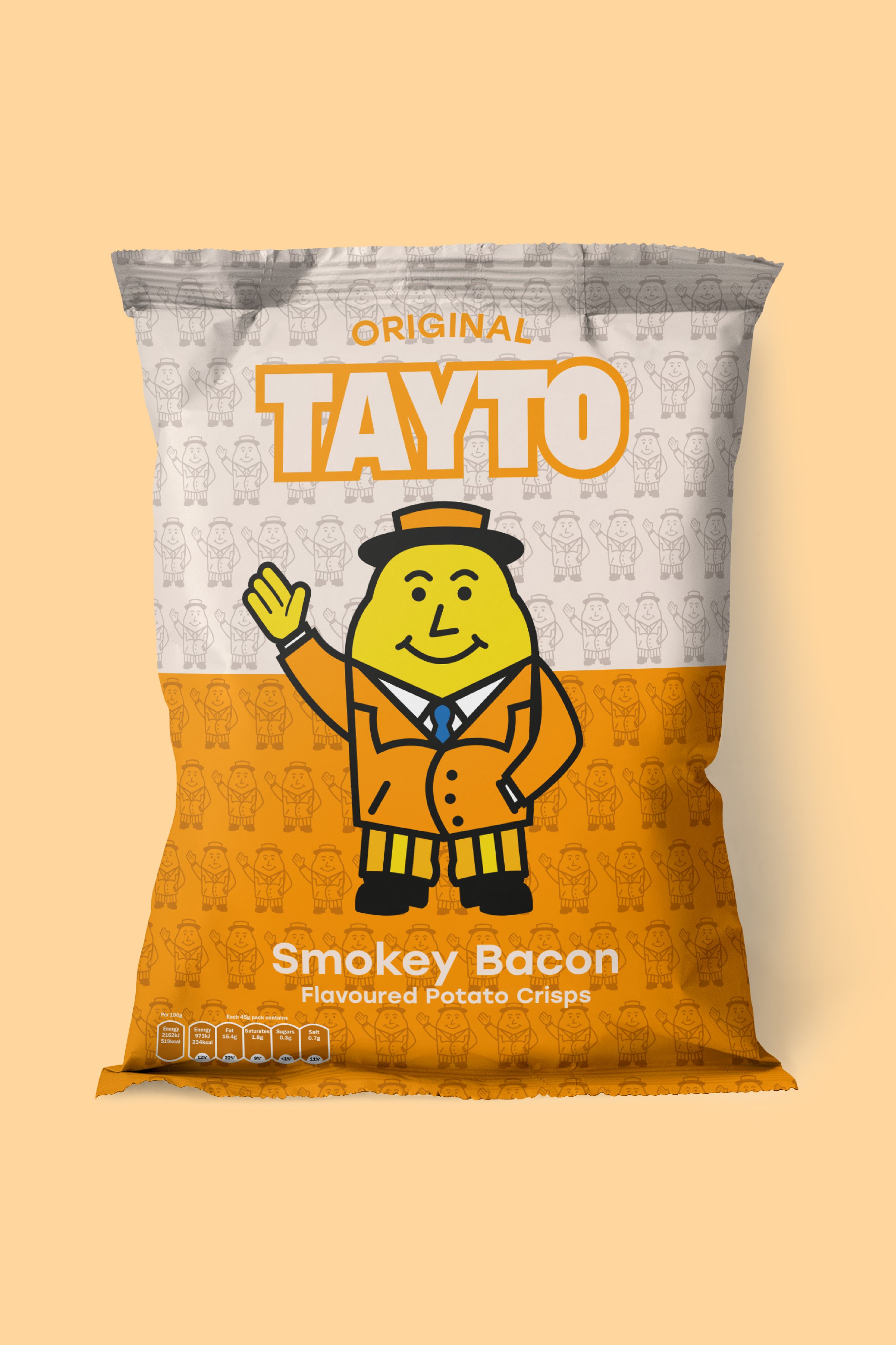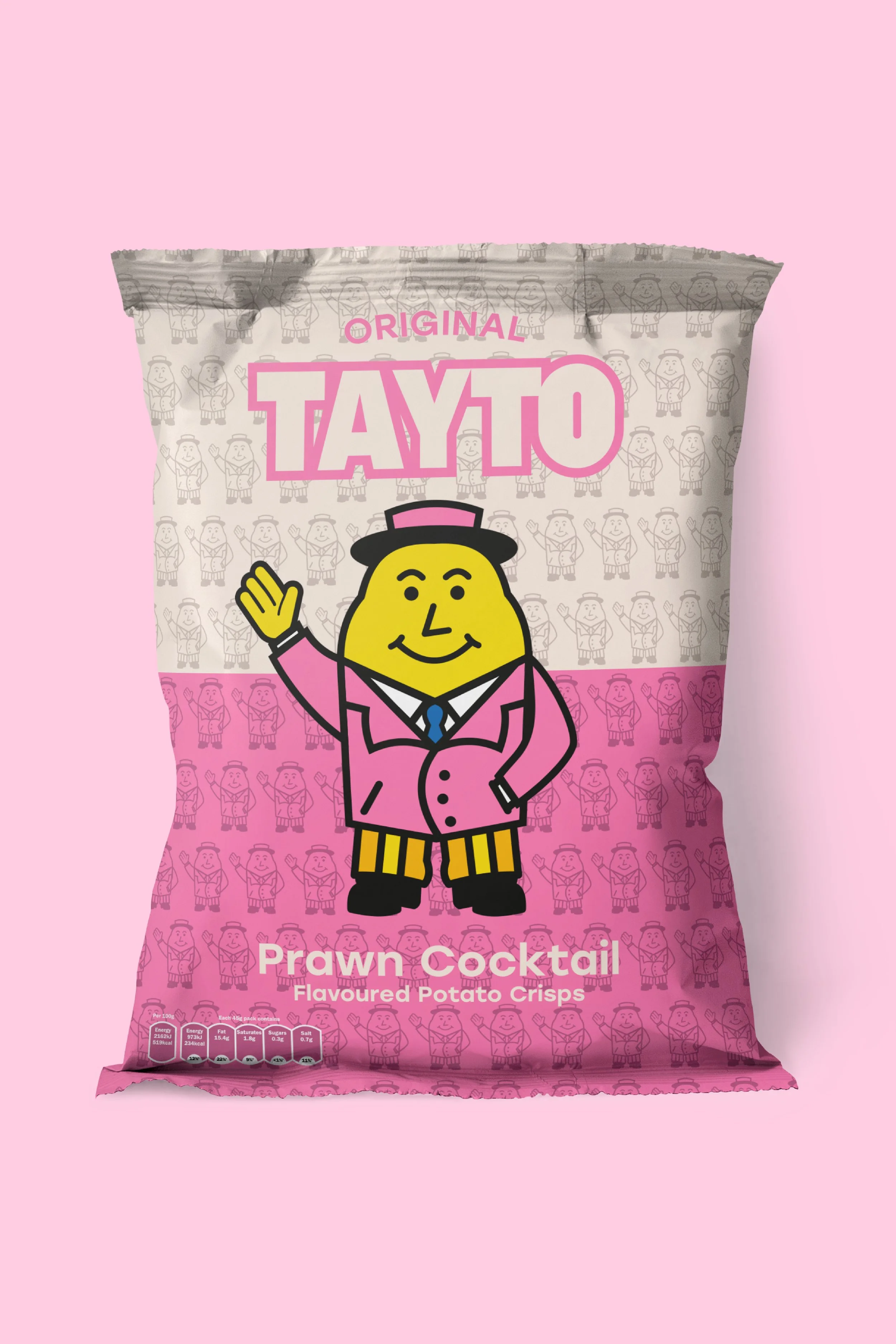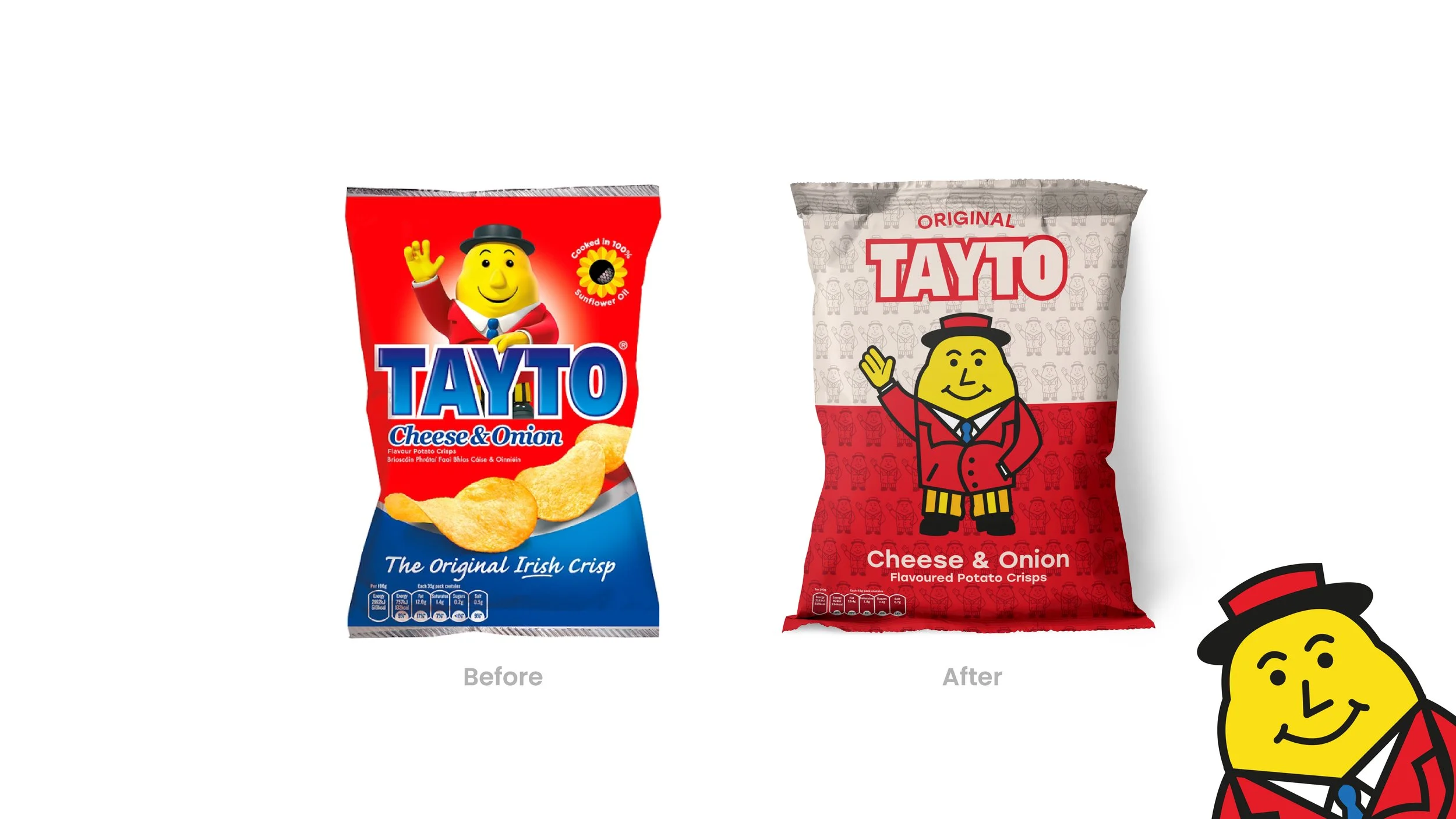
The Tayto Repackaging Project was part of my second year of college. We had to identify a well-known brand with poor or underwhelming packaging and bring it to life. I chose Tayto Crisps as I felt their packaging was stuck in the early 2010s with its 3D character model and various gradients.
My outcome brought me back to the flat style Tayto used in the past with an updated Mr. Tayto model fit with a new smile and overall friendlier look. Something that furthermore may take the consumer back to their youth when Tayto was the single crisp brand of Ireland.
Designer: Patrick Lindsay
